The light mode toggle journey
What started as "just add a theme toggle" turned into a several-hour deep dive into UX, CSS architecture, and the subtle art of not annoying the observer. Here's the story of how a simple button evolved through 6 iterations into something I'm actually proud of.
The starting point: a simple three-state toggle
The first implementation was straightforward. I wanted to offer a choice between Light, Dark, or Auto (follow system setting). The initial approach was a simple button that cycled through states:
const modes = ['auto', 'light', 'dark'];
toggle.addEventListener('click', () => {
  const current = getStored();
  const next = modes[(modes.indexOf(current) + 1) % modes.length];
  apply(next);
});
The CSS used a trick to make "Auto" work—instead of JavaScript detecting the system preference, I let CSS handle it:
:root.dark {
  --text: #f5f0e8;
  --bg: #1a1610;
  /* dark mode variables */
}

@media (prefers-color-scheme: dark) {
  :root:not(.light) {
    /* Same dark mode variables */
  }
}
The logic: if the user explicitly sets .light, the media query is ignored. If they set .dark, the explicit class takes precedence. If neither class is set (Auto mode), the media query kicks in.
Problem: The button just said "Auto", "Light", or "Dark"—showing the current state. But users don't care what mode they're in; they want to know what clicking will do.
Iteration 2: preview the next state
I flipped the mental model. Instead of showing the current state, the button now previews what you'll get when you click:
const nextMode = { auto: 'light', light: 'dark', dark: 'auto' };

function apply(mode) {
  const next = nextMode[mode];
  toggle.textContent = labels[next];
  toggle.setAttribute('data-next', next);
}
The button's background now showed a preview of the next theme:
.theme-toggle[data-next="light"] { background: #f5f0e8; color: #1a1307; }
.theme-toggle[data-next="dark"] { background: #1a1610; color: #f5f0e8; }
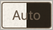
.theme-toggle[data-next="auto"] {
background: linear-gradient(to right, #f5f0e8 50%, #1a1610 50%);
}That split gradient for "Auto" was a fun touch—half light, half dark.
Problem: Cycling through three states still felt clunky. The button cycled auto → light → dark → auto..., so if I'm in dark mode and want light, I have to click twice (dark → auto → light). That's friction. Anyone who knows me knows I hate friction.
Iteration 3: the dropdown picker
Time to ditch the cycle. I replaced the button with a dropdown that shows all available options:
<div class="theme-picker" id="theme-picker">
  <div class="theme-picker-options">
    <button class="theme-option" data-theme="light">Light</button>
    <button class="theme-option" data-theme="dark">Dark</button>
    <button class="theme-option" data-theme="auto">Auto</button>
  </div>
  <button class="theme-picker-btn">Auto</button>
</div>
Click the button, dropdown appears, pick your theme. One click to any state. The current mode is hidden from the options (why show "Dark" when you're already in dark mode?).
I added smooth animations for the dropdown:
.theme-picker-options {
  opacity: 0;
  pointer-events: none;
  transform: translateY(-0.5rem);
  transition: opacity 0.2s ease, transform 0.2s ease;
}

.theme-picker.open .theme-picker-options {
  opacity: 1;
  pointer-events: auto;
  transform: translateY(0);
}
Problem: The theme change was instant and jarring. One moment you're in dark mode, the next—BAM—everything's white.
Iteration 4: smooth color transitions
I wanted the theme change to feel intentional, not like a glitch. The solution: temporarily enable transitions on everything:
body.theme-transitioning,
body.theme-transitioning * {
  transition: color 0.4s ease-out,
              background-color 0.4s ease-out,
              border-color 0.4s ease-out !important;
}
function apply(mode, animate = false) {
if (animate) {
document.body.classList.add('theme-transitioning');
doApply();
setTimeout(() => {
document.body.classList.remove('theme-transitioning');
}, 400);
} else {
doApply();
}
}The animate parameter is only true when the user explicitly clicks an option—not on page load. Nobody wants to watch a 400ms animation every time they navigate.
Problem: The transition was on body, but my background color is set on html (to extend to the full viewport). The body transitioned smoothly while the html snapped. Oops.
If you watch closely, there's also what I considered a bug in this iteration: the text color animates to its new target color but right at the end, jankily locks into place. Not acceptable.
Iteration 5: fix the viewport sync
A quick fix—apply the transition class to html instead of body:
html.theme-transitioning,
html.theme-transitioning * {
  transition: color 0.4s ease-out,
              background-color 0.4s ease-out,
              border-color 0.4s ease-out !important;
}
And in JavaScript, document.body becomes document.documentElement (the <html> element).
Now the entire viewport transitions together--that's what I was aiming for.
Problem: The dropdown was showing options that wouldn't actually change anything. If you're in Auto mode and your system is set to dark, clicking "Dark" does... nothing. That's because "Auto" follows your OS preference—if your OS is already in dark mode, then clicking "Dark" wouldn't actually change anything. This bothered me. A lot. Clicking an option means the theme of the page should always visibly react. A click that does nothing is not acceptable.
Also, the bug first mentioned in iteration 4: still present 😠.
Iteration 6: the "humanize" commit
This was the insight that made everything click. The dropdown shouldn't show all options—it should only show options that would cause a perceptible visual change.
function getSystemPref() {
  return window.matchMedia('(prefers-color-scheme: dark)').matches
    ? 'dark'
    : 'light';
}

function getEffectiveTheme(mode) {
  return mode === 'auto' ? getSystemPref() : mode;
}

function apply(mode, animate = false) {
  const currentVisual = getEffectiveTheme(mode);

  options.forEach(opt => {
    const optionVisual = getEffectiveTheme(opt.dataset.theme);
    const isSameMode = opt.dataset.theme === mode;
    const wouldChangeNothing = optionVisual === currentVisual;
    opt.classList.toggle('hidden', isSameMode || wouldChangeNothing);
  });
}
Now, if you're in Auto mode with a dark system preference:
- "Dark" is hidden (you're already seeing dark)
- "Auto" is hidden (it's the current mode)
- Only "Light" is shown (the one option that would actually change something)
This is the kind of detail that separates "works" from "feels right" to me.
The final result
Six iterations later, I have a theme picker that:
- Shows what you can do, not what you've done
- Respects your system preference with a true Auto mode
- Transitions smoothly when you change themes
- Only offers meaningful choices—no dead-end options
- Remembers your preference in localStorage
- Responds to system changes (switch your OS to dark mode while in Auto, and the site follows)
The full implementation is about 80 lines of CSS and 50 lines of JavaScript—no frameworks, no dependencies.
Lessons learned
Start simple, iterate based on friction. Each iteration addressed a real annoyance I felt while using the site. I didn't plan all six iterations upfront.
Think in terms of user intent, not system state. The "humanize" commit was the biggest UX win, and it came from asking "what does clicking this do?" instead of "what are all the options?"
CSS can do more than you think. The prefers-color-scheme media query with :not(.light) selector handles Auto mode without any JavaScript detection.
Transitions matter. A 400ms fade makes a theme change feel intentional. An instant swap feels like a bug. At least it did to me. Of course there are people who'd prefer the instant swap, but I found the transition made the experience feel more polished and deliberate.
Sometimes the best features aren't built—they're discovered.